Table of Contents
Introduction: The Power of Color in Branding
Visual branding is more than just logos and design; it’s an emotional language that speaks to your audience at first glance. Among the many elements that shape a brand’s identity, color is the most immediate and universal. The psychology of colors has been studied for decades, revealing that hues influence emotions, behaviors, and perceptions. For businesses, the strategic use of colors can mean the difference between creating a memorable identity and blending into the background.
When chosen wisely, colors evoke trust, excitement, calmness, or energy. They can make a brand feel luxurious or budget-friendly, friendly or authoritative. This article dives deep into how colors impact branding, helping you harness their potential to elevate your business’s visual identity.
1. The Science of Color Psychology
Color psychology is the study of how colors influence human emotions and behavior. It’s not just a theory but a practice supported by numerous studies. Humans are hardwired to associate certain colors with specific feelings or actions. For instance, red often signals urgency or passion, while blue communicates trust and stability. Understanding these associations can empower businesses to make strategic decisions about their branding.
Colors interact with light and our biological wiring. For example, warm colors like red and yellow stimulate energy and creativity, whereas cool colors like blue and green evoke calmness and reliability. Cultural factors also play a significant role in color interpretation. While white symbolizes purity in Western cultures, it represents mourning in parts of Asia.
Businesses must consider the emotional and cultural dimensions of color. A brand targeting international markets might need different palettes for different regions. Incorporating color psychology into your branding strategy ensures your message resonates universally.
Image Prompt: A visual infographic showcasing how different colors influence emotions, with examples such as red for urgency and blue for calmness, overlaid on a gradient background.
2. Decoding Colors: What They Say About Your Brand
Each color has its unique psychological impact, and when used correctly, it communicates specific messages to your audience. Here is a breakdown of key colors and their implications for branding:
Red: Passion, Energy, and Urgency
Red is bold and attention-grabbing. It’s often used by food and retail brands to evoke excitement or hunger. Examples include Coca-Cola and Target. However, too much red can be overwhelming, so balance is key.
Blue: Trust, Stability, and Professionalism
Blue is a favorite among tech companies and financial institutions, symbolizing reliability. Think of Facebook and PayPal. It’s also a calming color, making it ideal for healthcare or wellness brands.
Yellow: Optimism, Warmth, and Creativity
Yellow is uplifting and cheerful, often associated with creativity and youth. Brands like McDonald’s and Snapchat use yellow to convey friendliness and energy.
Green: Growth, Health, and Sustainability
Green signifies nature, growth, and balance. Eco-friendly and wellness brands like Whole Foods and Starbucks often lean on green to emphasize their values.
Black and White: Luxury, Simplicity, and Sophistication
Black denotes elegance and power, while white reflects purity and minimalism. Together, they create timeless and versatile branding, as seen in brands like Chanel and Apple.
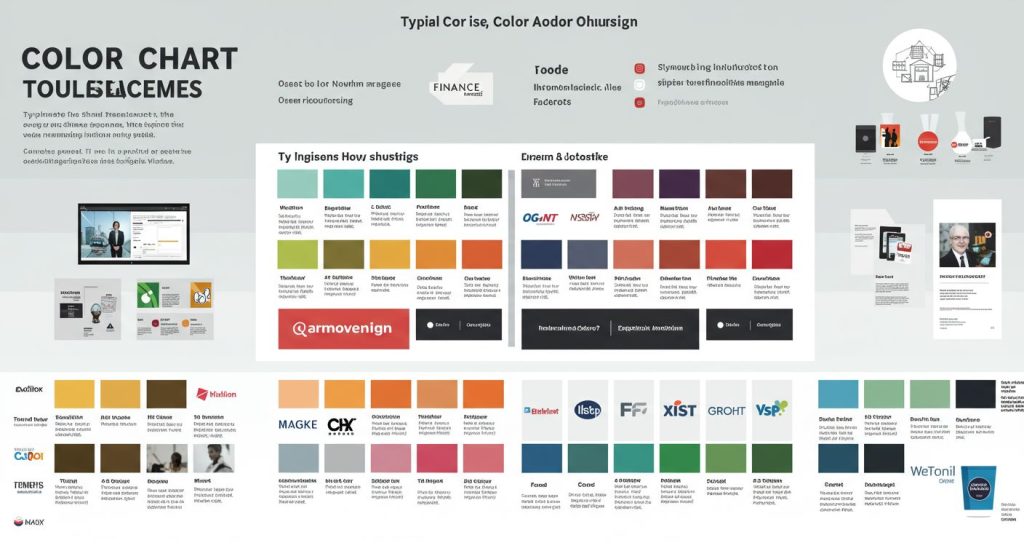
3. Creating a Balanced Color Palette
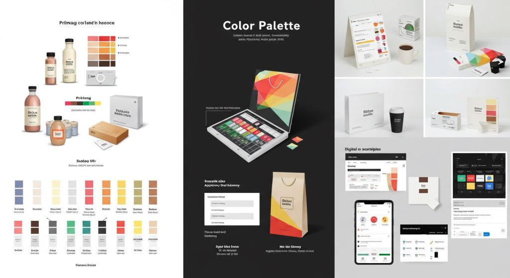
Choosing a single color for your brand is only the first step. Successful branding often involves a harmonious palette that supports the core message. A well-crafted color palette ensures visual consistency across your website, marketing materials, and physical products.
The Role of Primary, Secondary, and Accent Colors
Your primary color dominates your branding and communicates your central message. Secondary colors complement the primary shade, while accent colors are used sparingly for emphasis. For example, Spotify’s primary green is supported by black and white secondary shades, with occasional neon accents.
Tools for Selecting a Color Palette
Several tools, like Adobe Color and Coolors, can help you experiment with palettes. These tools ensure balance between complementary and analogous colors, making your brand visually appealing.
Testing Your Palette for Versatility
A good palette works across various mediums and devices. Test it in digital and print formats, as well as in monochrome settings, to ensure it remains impactful.
4. Industry-Specific Color Choices
Colors aren’t one-size-fits-all; the right palette depends on your industry and target audience. Here are some examples:
Retail and E-Commerce
Bright, attention-grabbing colors like red, orange, and yellow often dominate retail branding to encourage impulse purchases. Amazon’s use of orange conveys energy and affordability.
Technology
Tech companies prefer cool, professional tones like blue and grey to symbolize innovation and trust. Google’s multicolored logo stands out by incorporating creativity and inclusivity.
Health and Wellness
Green and blue are favorites in this sector, signaling health, balance, and tranquility. Brands like Calm and Fitbit effectively use these tones to reinforce their missions.
Luxury and Fashion
Black, gold, and white are go-to colors for high-end brands, emphasizing sophistication and exclusivity. Gucci and Rolex demonstrate how these shades create an aura of elegance.
5. Cultural Considerations in Color Psychology
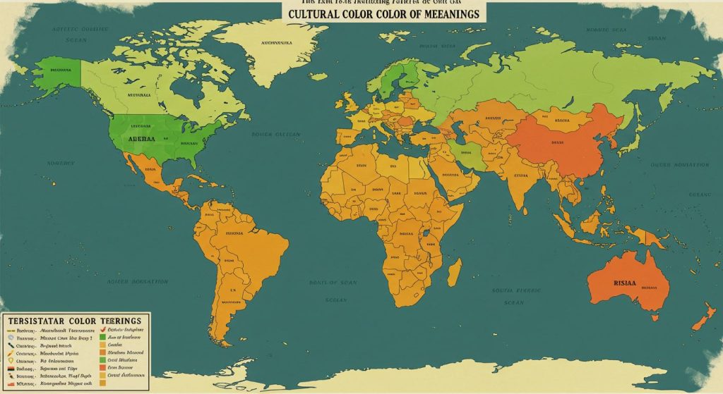
Colors carry different meanings across cultures, so understanding your audience is critical. For example, red signifies luck in China but can symbolize danger in Western countries. Similarly, purple is associated with royalty in some regions but mourning in others.
Global brands often tailor their palettes for regional markets. McDonald’s uses red and yellow globally but has incorporated green in European outlets to reflect environmental consciousness.
6. Tips for Testing and Refining Your Brand Colors

Testing is an essential part of any branding strategy. Surveys, A/B testing, and focus groups can help you gauge how your target audience responds to different color schemes.
Conducting A/B Tests
Present two versions of a logo or website with varying color schemes to a sample audience. Analyze the engagement metrics to determine which palette resonates better.
Using Analytics
Track metrics like click-through rates and time-on-page to measure the effectiveness of your colors in digital campaigns.
Iterating Based on Feedback
Collect feedback from customers and stakeholders, refining your palette to align better with your brand’s goals.
Conclusion: The Art and Science of Color in Branding
Colors are powerful tools in branding, capable of shaping perceptions and driving actions. From understanding the psychology behind each hue to crafting a harmonious palette and considering cultural nuances, your brand’s colors should be intentional and strategic. By mastering color psychology, you can create a memorable and emotionally resonant identity that connects deeply with your audience.